06 · Product & UX/UI
Godrej Consumer Products · Packaging R&D
Packaging as a
User Experience
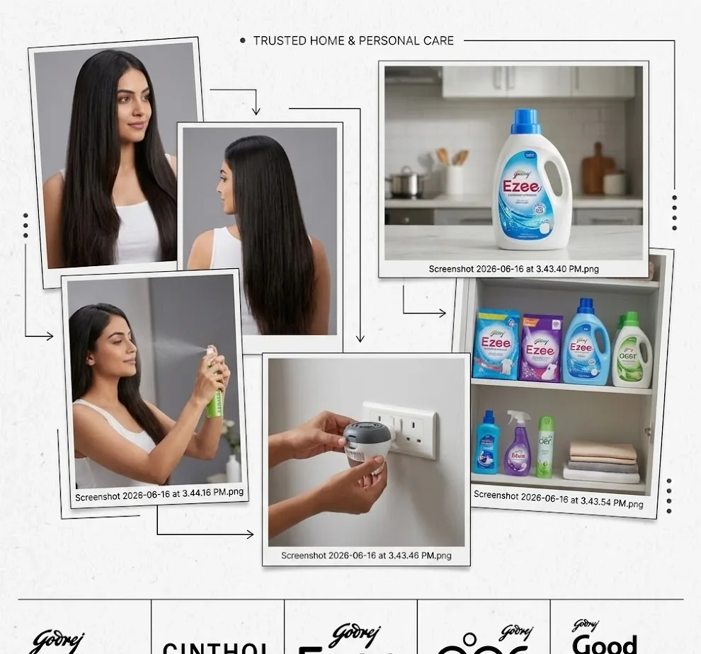
UX research on objects people hold. How they open, read, grip and store everyday products, down to material and type size.
38Friction points
14Changes made
4Categories
11Vendor sample rounds
5Company standards
01
Problem and method
Test the pack before it is locked.
Packs were judged after tooling and artwork were final. I moved that moment earlier.
Questions
- Where do people struggle: shelf, open, use, store?
- Can they find key label info in 5 seconds?
- What drives or blocks purchase at shelf?
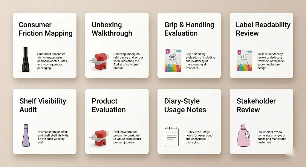
ShelfSimulationAmong 4 to 6 rival SKUs
HandUseOpen, dispense, close, store
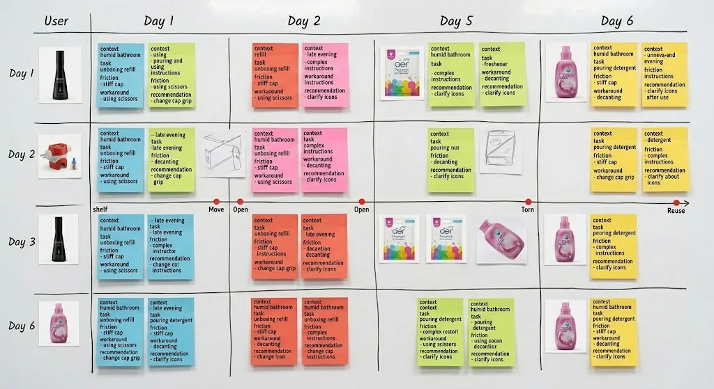
HomeDiaries4 to 6 weeks
LabelLegibilitySize, contrast, priority
MaterialSurfacesFinish and structure
02
Deep dive · Aer Pocket
Reading a pack by touch and light.
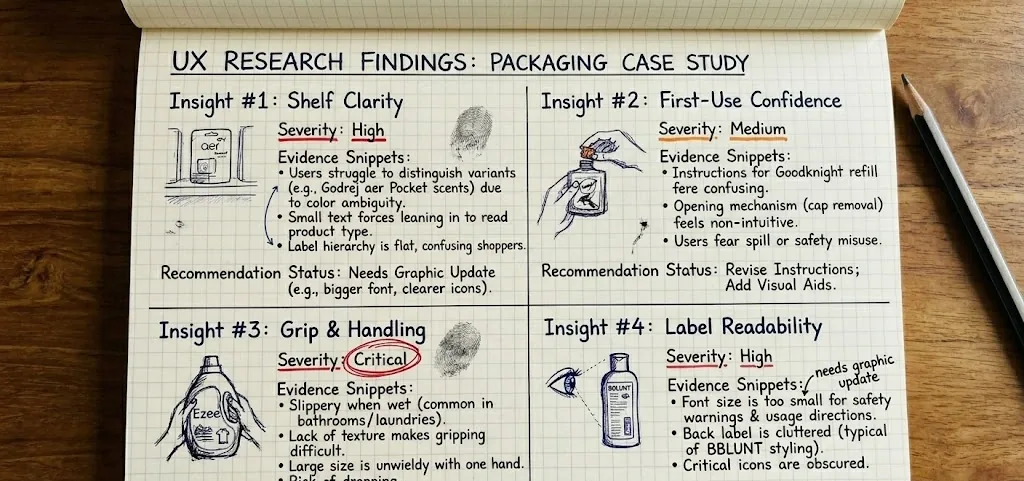
The highest-severity pack. I studied its surfaces before writing any spec.
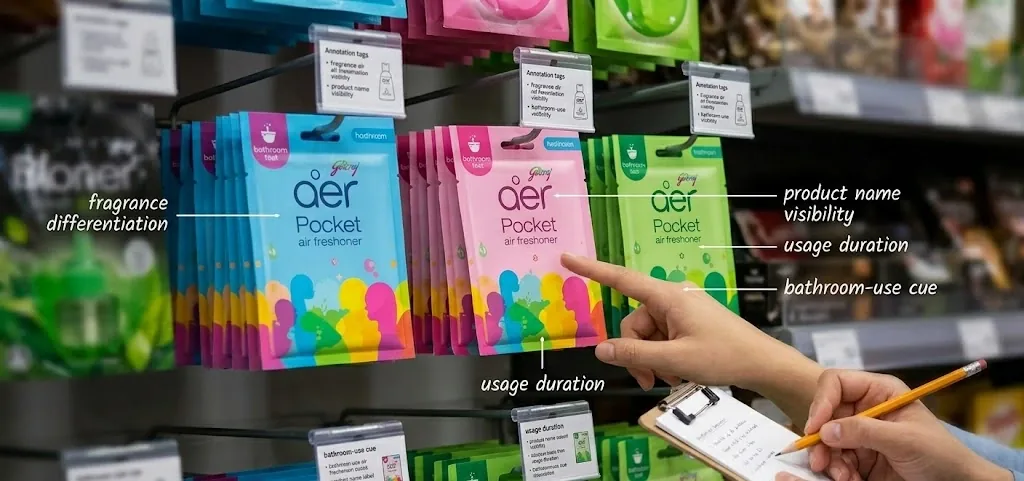
- Fragrance colourDoes colour alone separate variants at 2 m?
- SealNo pull-tab. One person took 40 seconds.
- PlacementCue seen only after hanging, 3 of 5 times.
Material study
Reference renders I made to document each surface. Product photos are from the study.




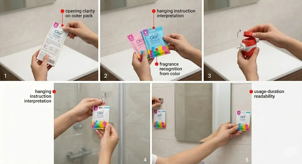
- Step 1Opening clarity on the outer pack.
- Step 2Fragrance recognition by colour.
- Steps 3 and 4Reading the hanging instructions.
- Step 5Usage duration on the wall.
Finding to specification
FindingSpecification
Foil seal with no grip8 mm foil pull-tab
Placement cue found too lateDiagram on the carton face
Instructions unread in dim rooms9 pt minimum, 7 pt for regulatory only
Artwork judged in office light200-lux warm-light review
Variants blur at distance2 m shelf-distance test
03
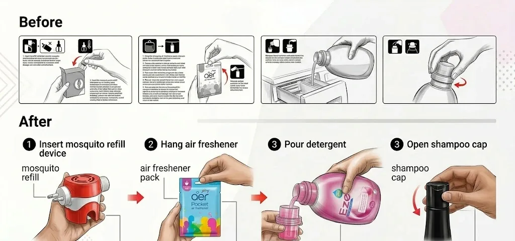
Material and label library
Every surface tells you something.
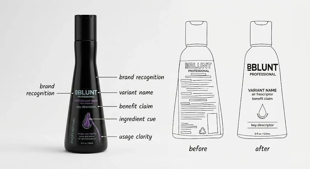
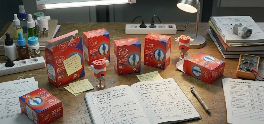
Finish, transparency and print density, catalogued across the range.



04
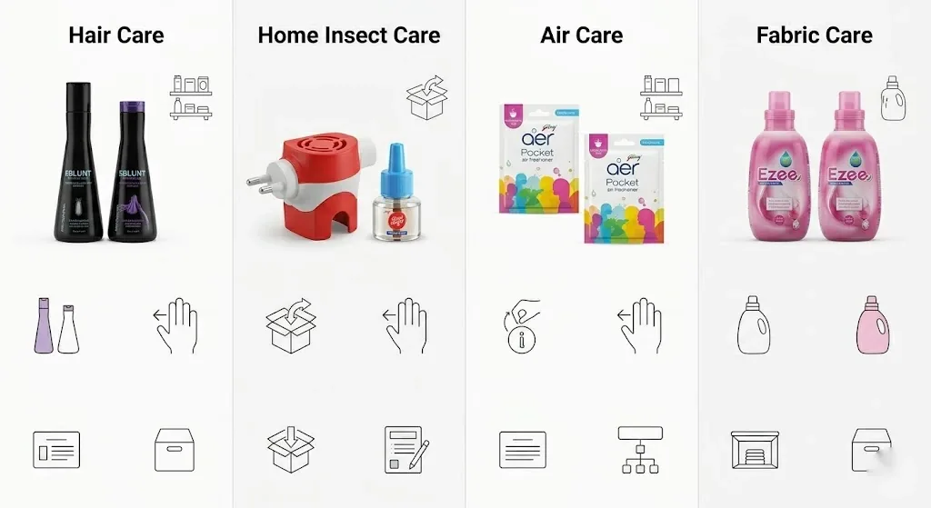
Findings by product
What the hands revealed.
- No tear notchSachet spilled in 3 of 5 sessions.
- 7 pt instructionsOn uncoated stock.
- Wrong orderTube opened before developer.
- Look-alike packsMachine and refill nearly identical.
- Insertion4 of 5 inserted wrongly at first.
- Mode switch“1 / 2” misread as on and off.
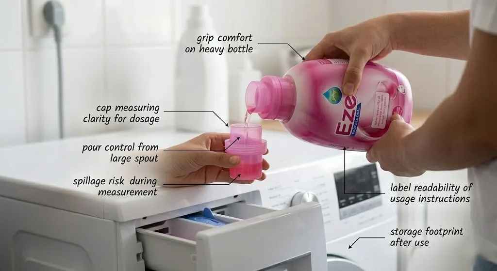
- Invisible cap linesOver-dosing in all 5 sessions.
- Wide spoutFast, uncontrolled pour.
- Back-label dosageMissed by 4 of 5.
05
Patterns and redesign
Design for the first use.
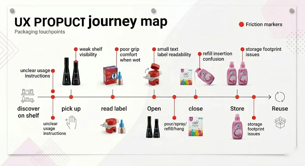
Packaging journey
1DiscoverShelf
2Pick upGrip
3ReadLabel
4OpenSeal, cap
5Close
6StoreFootprint
7ReuseRefill
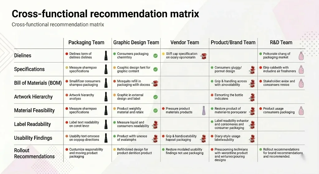
- BBLUNT9 pt instructions, tear notch, step stickers, shade name first.
- GoodknightREFILL band, orientation pictogram.
- Aer Pocket8 mm pull-tab, placement diagram.
- EzeePrinted cap lines, flow restrictor, front dosage.
Core insight
People don’t read before they act. They look for instructions when something goes wrong.