eCommerce redesign · Self-initiated concept
Zara, a quieter
way to shop
Zara’s site felt like a maze. I redesigned it to feel like its stores: calm, well lit, product first.
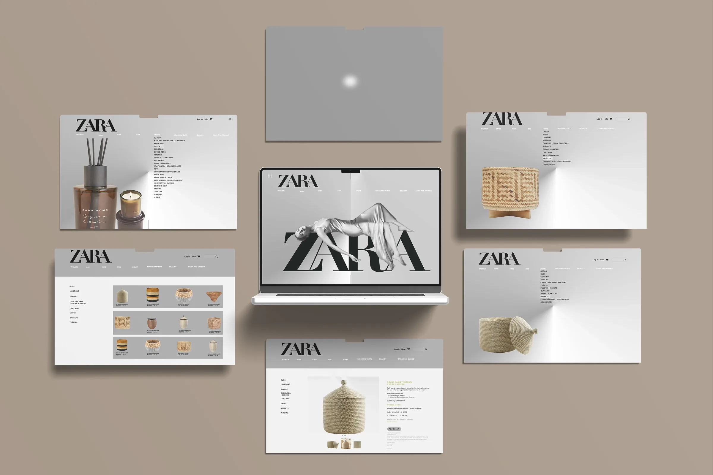
Motion
See it move.
The intro and a walk through the redesigned pages.
Context and challenge
Strong brand.
Tiring site.
Zara’s eCommerce is known worldwide. Its usability breaks the shopping journey.
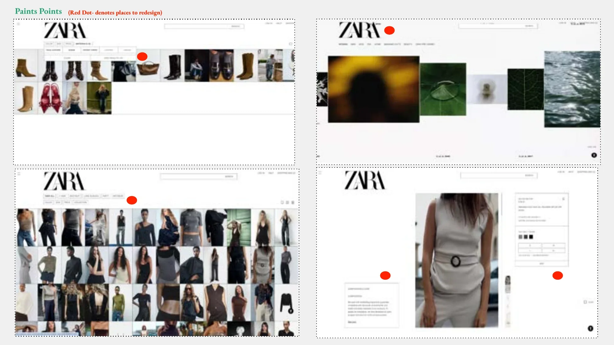
- ClutterAutoplay videos fight the product.
- NavigationShoppers lose their place.
- HierarchyBackgrounds outshine products.
- ToneCold, unlike the stores.
“A design should guide users, not challenge them.”
On the user journey
“When the background is more engaging than the products, the design has lost its purpose.”
On product focus
“Good design helps you find what you need. Bad design makes you question if you’re on the right page.”
On navigation
Quotes from my critique of the live site, lightly shortened.
Research and insights
Where shoppers got stuck.
Heuristic analysis and user testing of the digital flow.
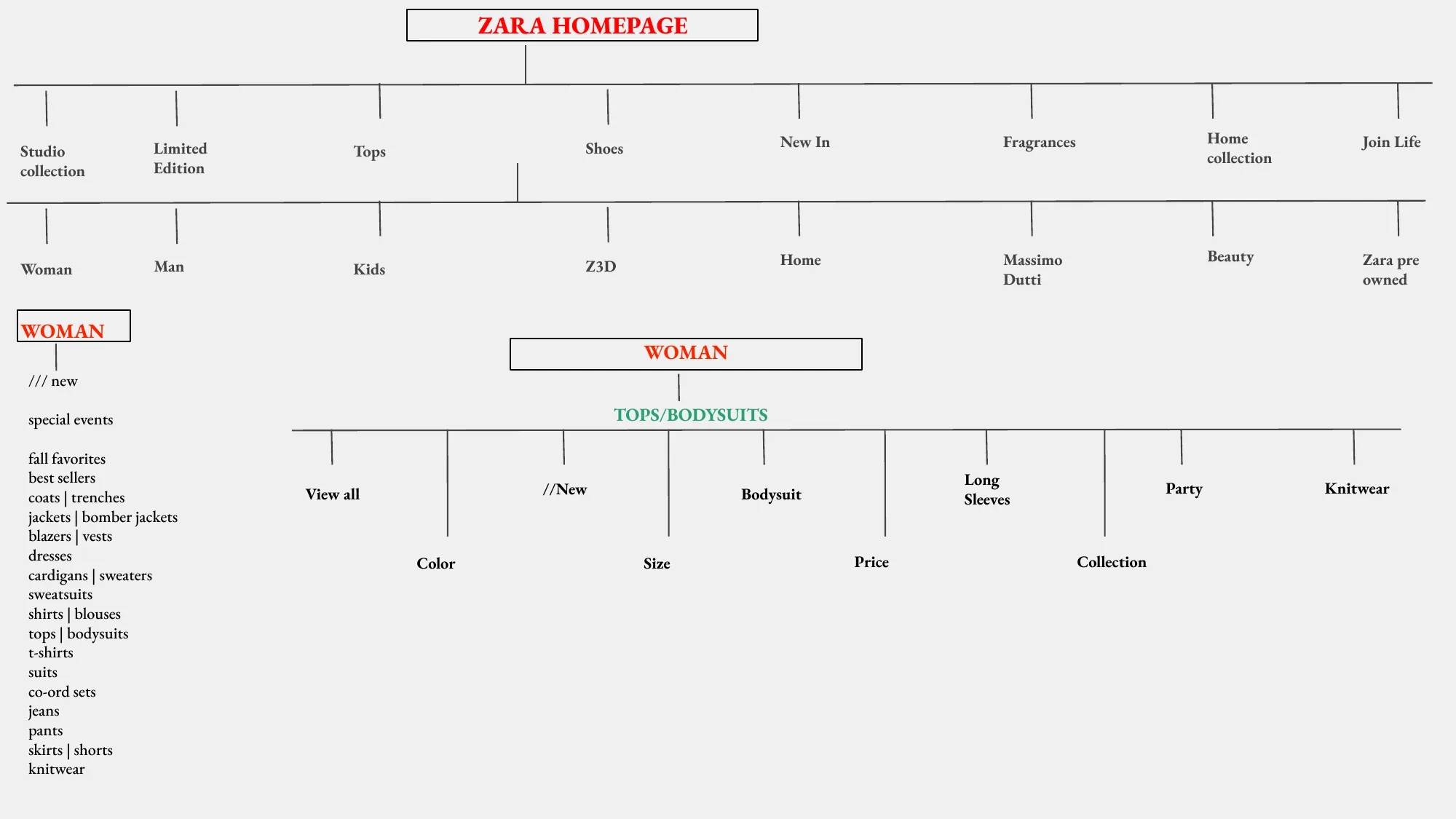
- “Am I on the right page?”Users lost track of where they were.
- Heavy path to checkoutBrowsing to buying felt slow.
- Flat product hoverLittle interaction. Low engagement.
Design goals
Three principles.
Empathy
Simpler navigation. Less cognitive load. Supported, not overwhelmed.
Ethical innovation
Transparent product info. WCAG AA. Join Life eco collection made visible.
Systems thinking
Modular grid, consistent navigation, a system that scales across the catalog.
Inspiration
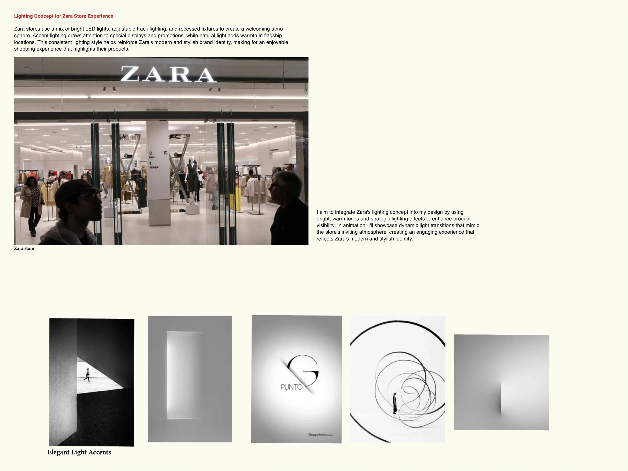
Bring the store’s light online.
LEDs, track light and accent spots make Zara stores feel inviting. The site had none of it.

- Accent lightBecomes a soft hover glow.
- Warm and cool mixBecomes a dual-tone backdrop.
- Open floorBecomes generous whitespace.
Direction
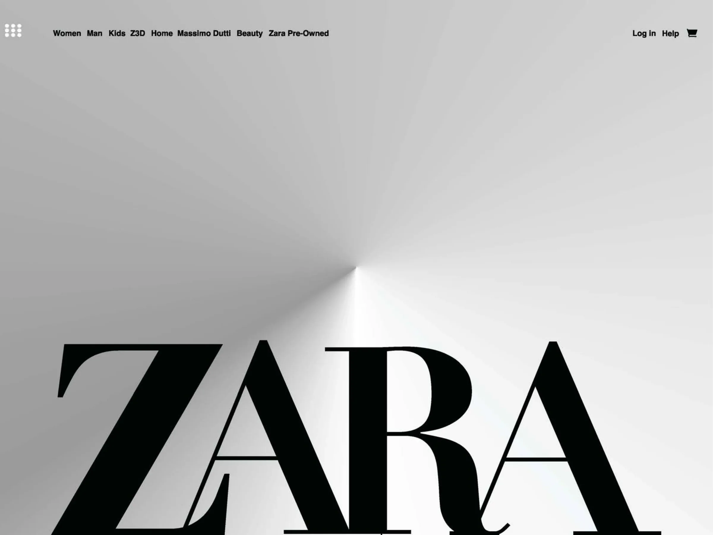
Cool clarity, warm light.
Two mood boards. One merged system.
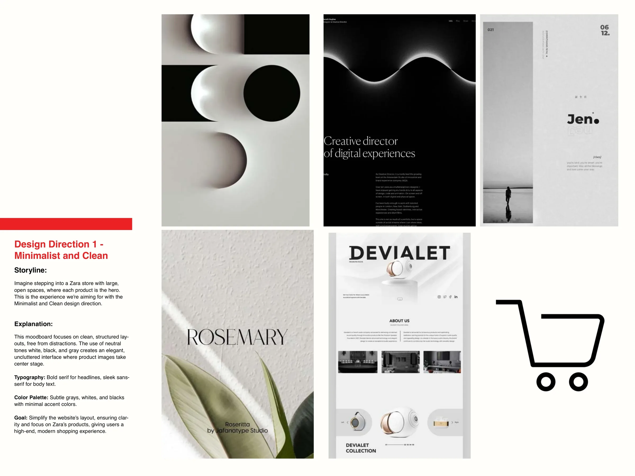
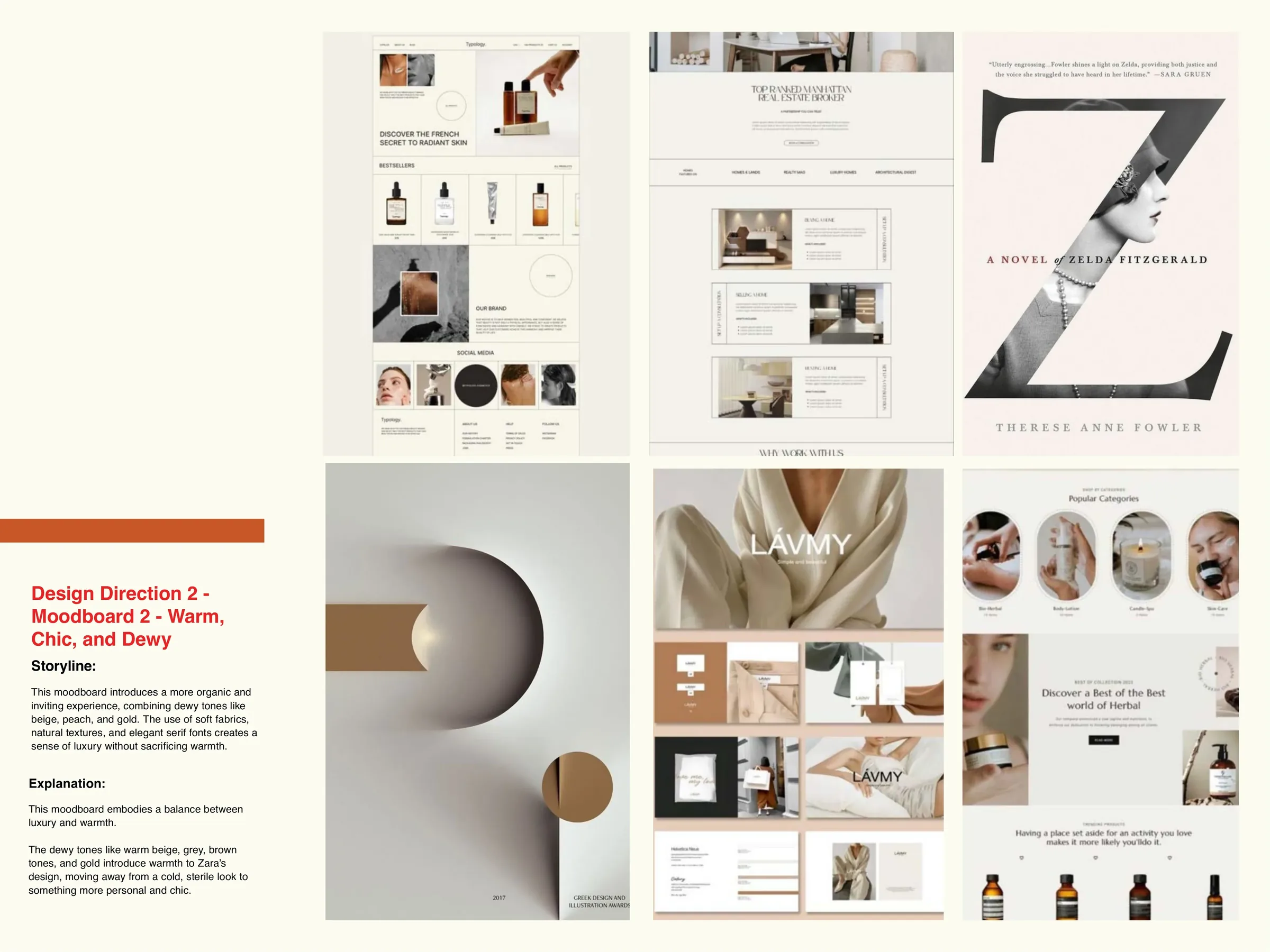
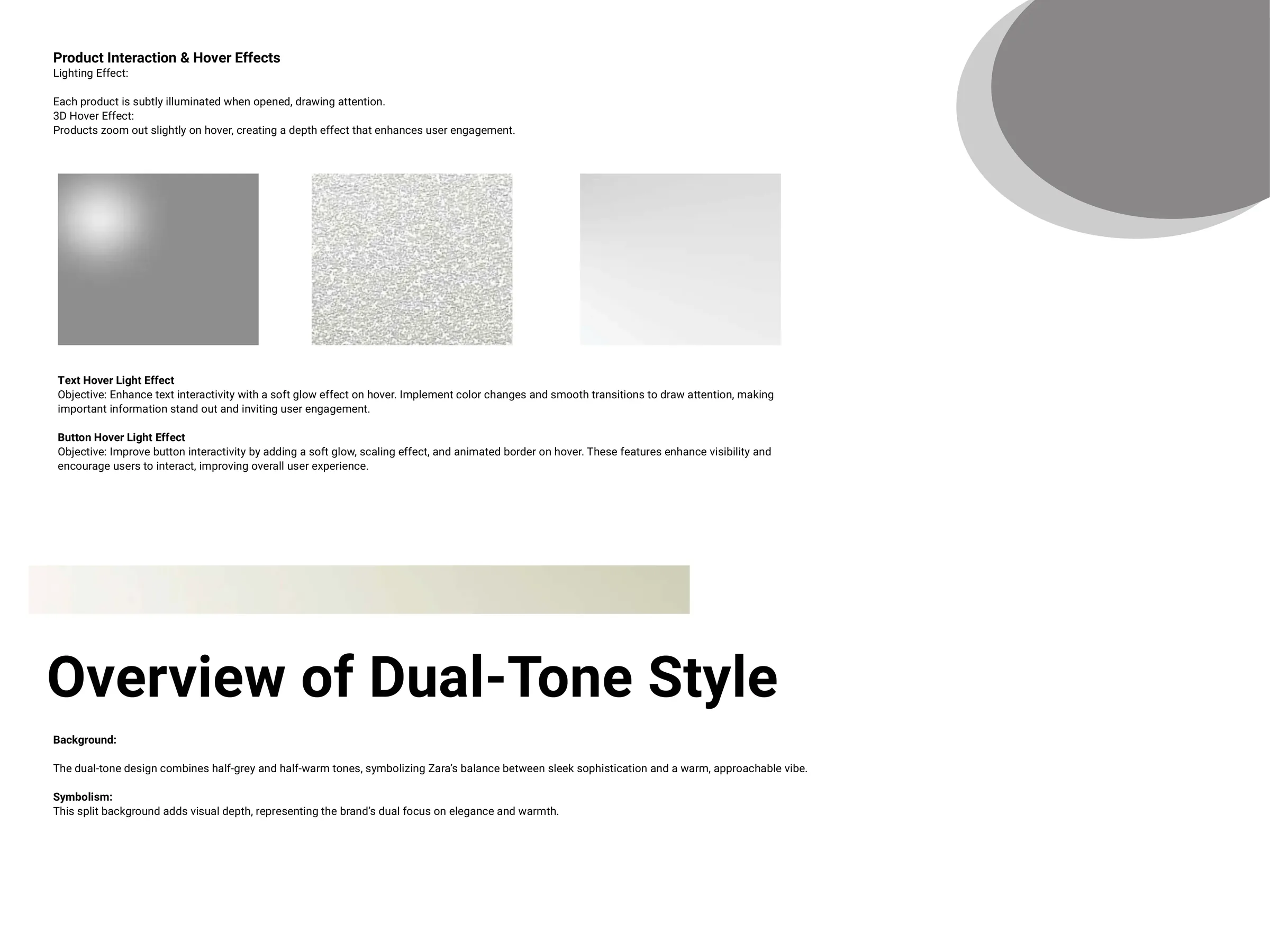
- Dual toneHalf grey, half warm. Sleek and approachable.
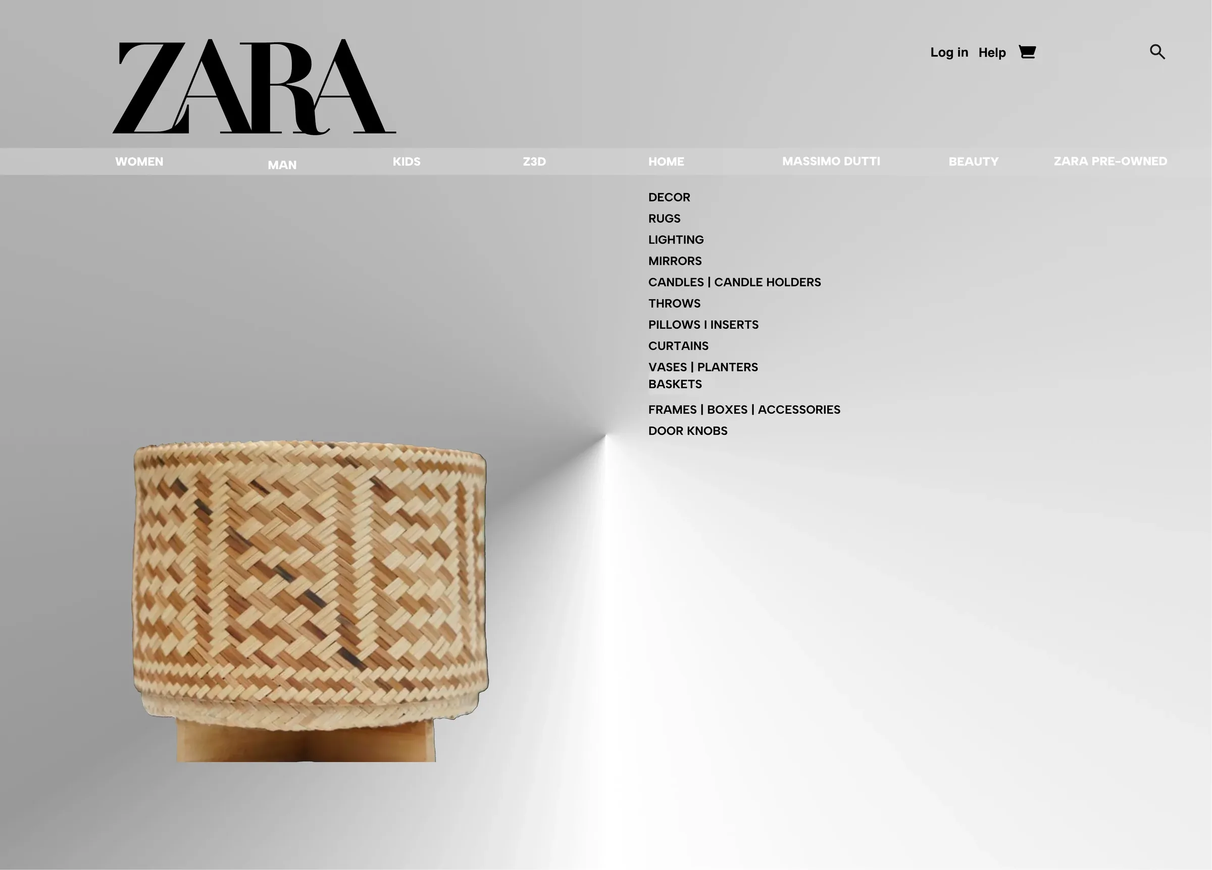
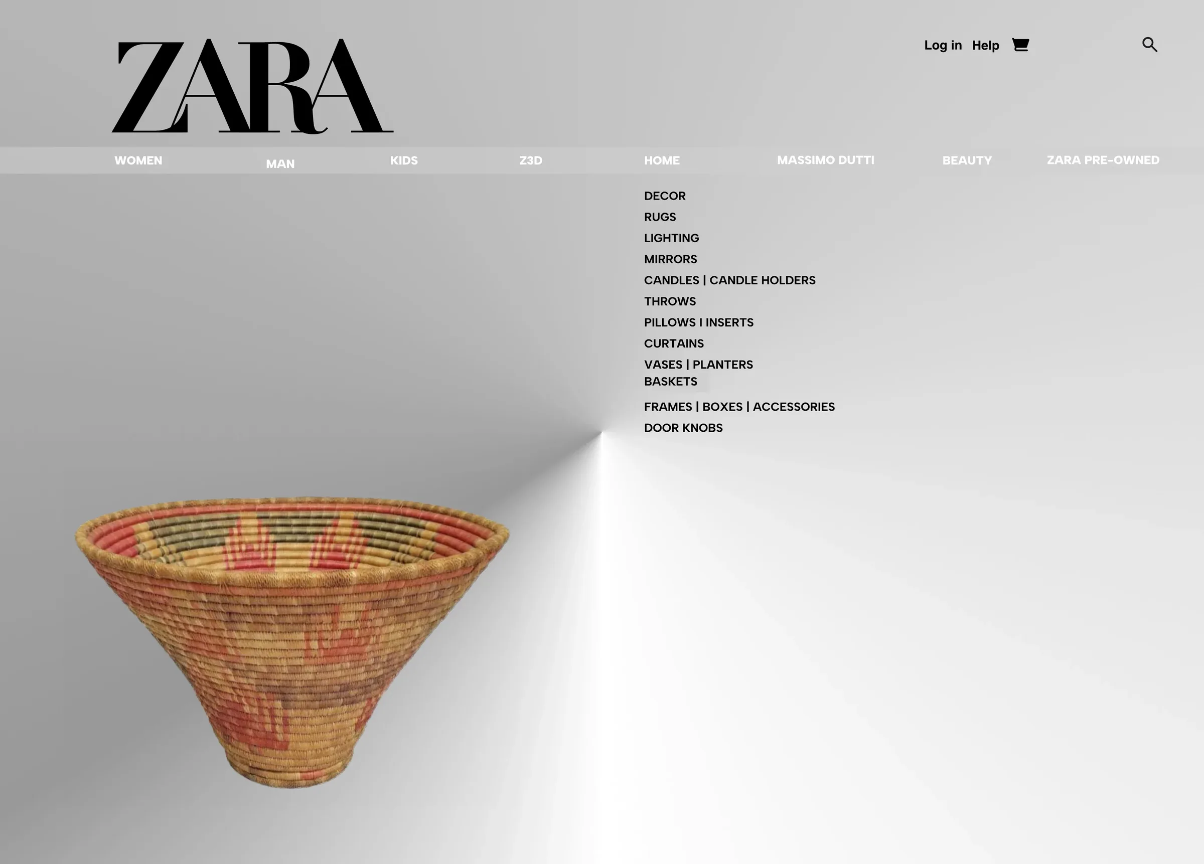
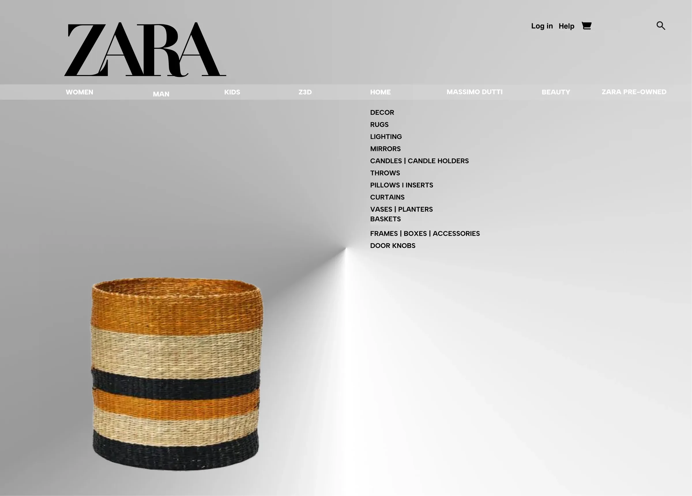
- Soft spotlightEach product lit as it opens.
- Silver grainDepth without decoration.
Key solutions
Homepage. Product. Basket.
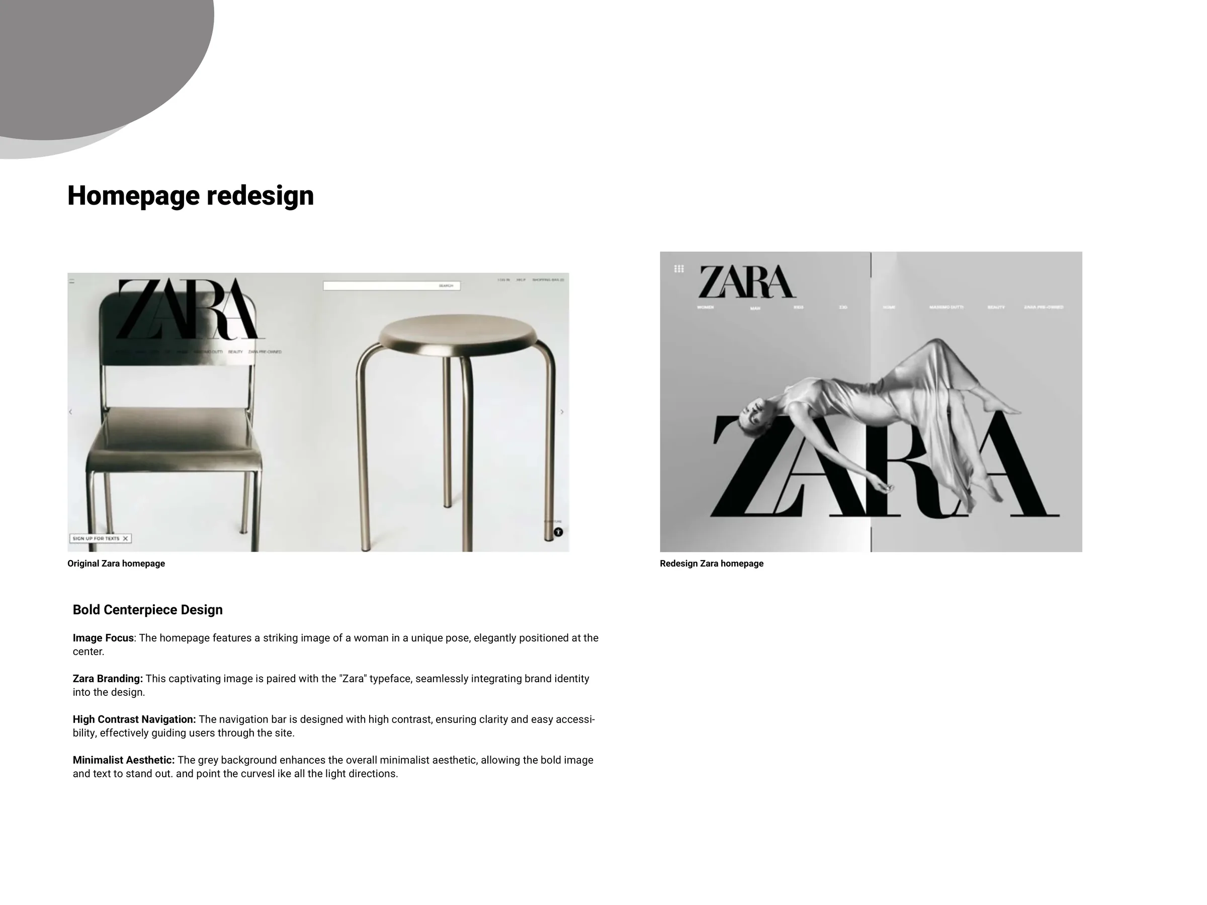
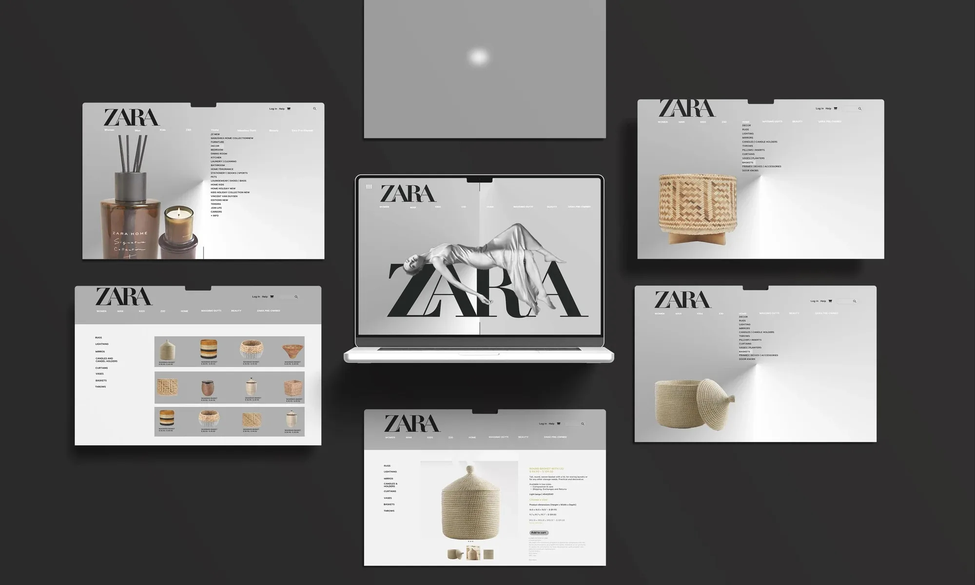
Homepage
One bold centrepiece. A fixed, high-contrast nav.
Category
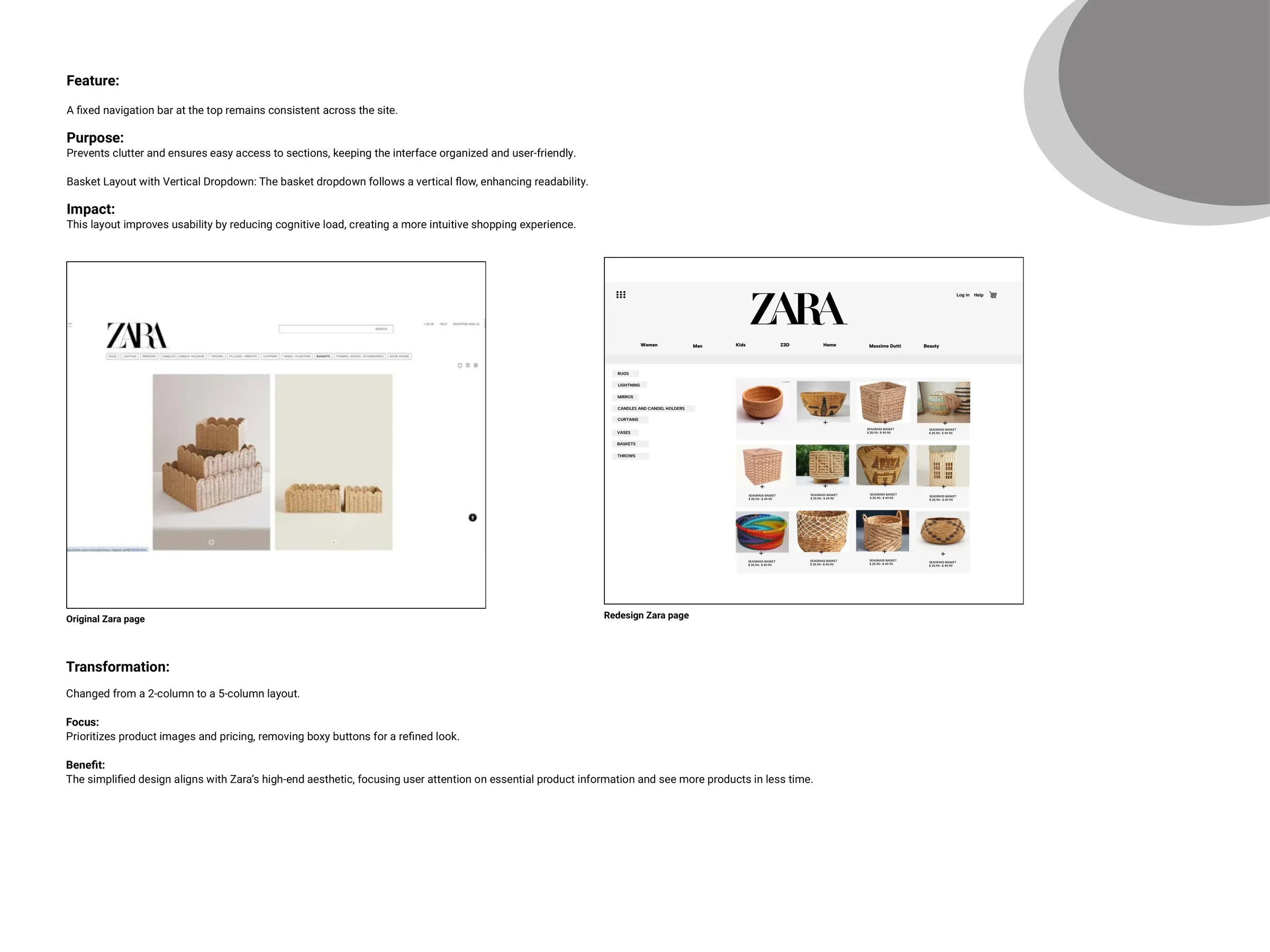
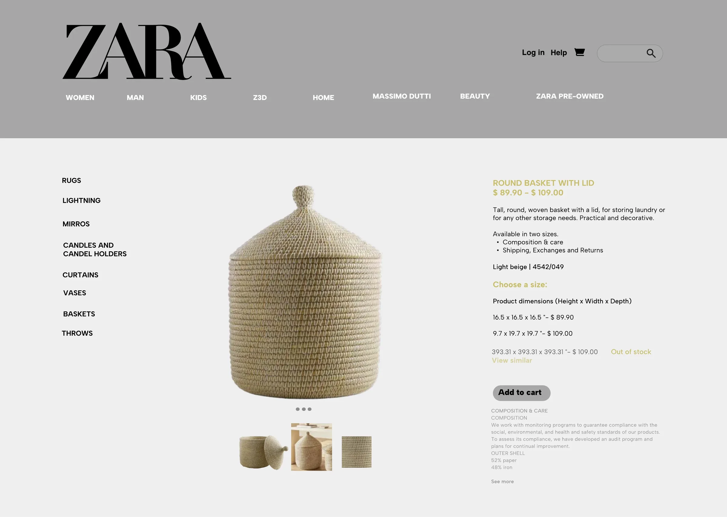
Two columns to five. Images and prices only.
Product
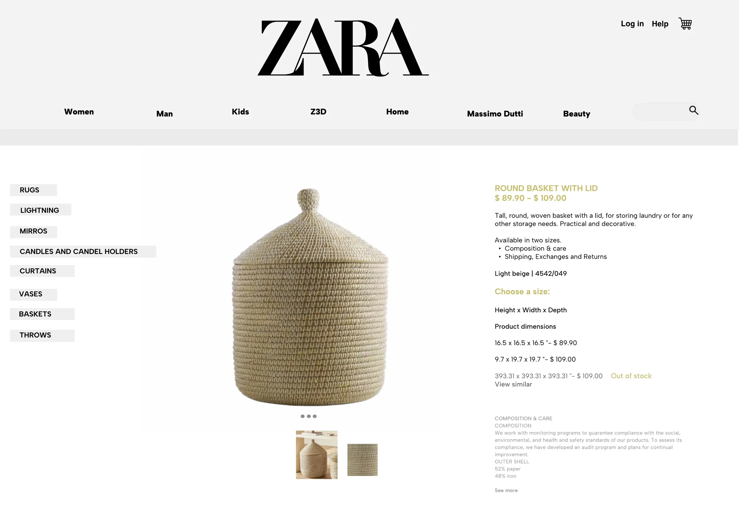
- Lighting effectEach product glows softly when opened.
- 3D hoverA slight zoom adds depth.
- Clear filtersSize, colour and price, easy to scan.
Basket and checkout
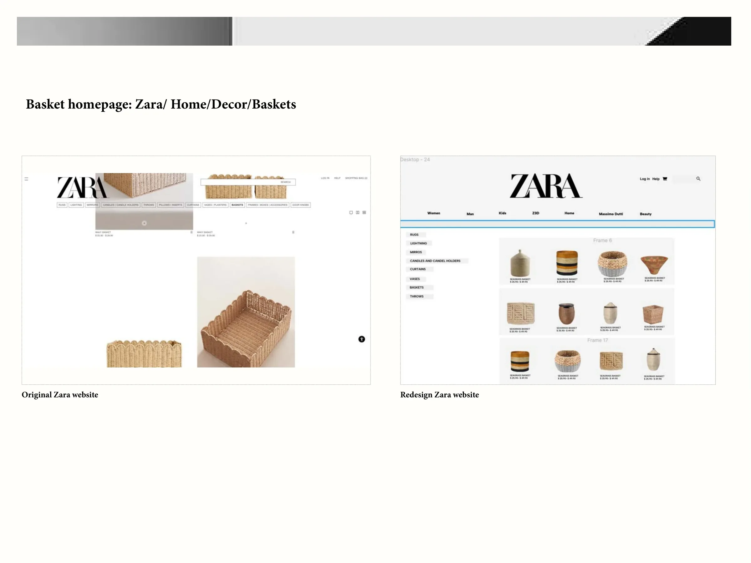
- Vertical dropdownEasier to read, less to process.
- Clear delivery and returnsFewer, transparent steps.
- Mobile firstLarger touch targets.


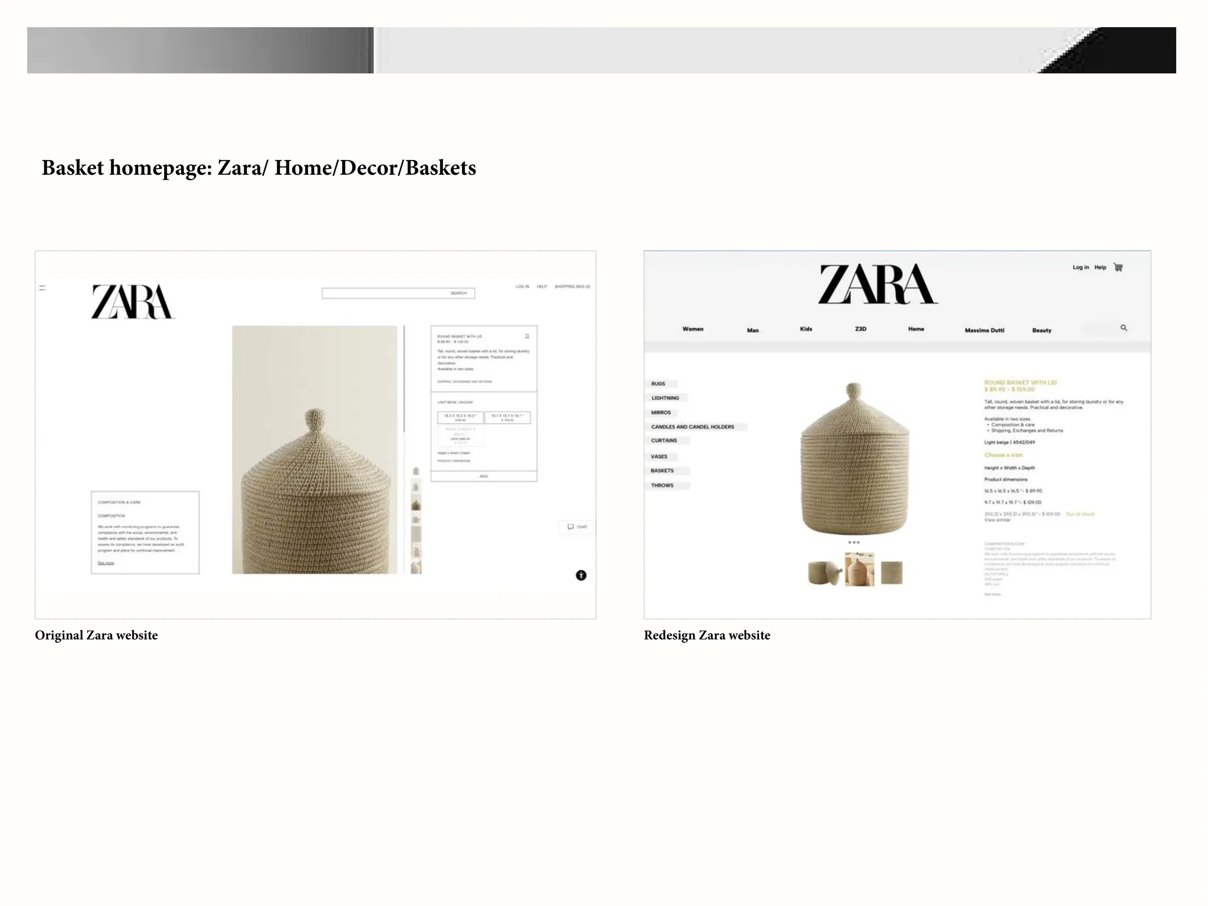
Screens
A gallery, screen by screen.
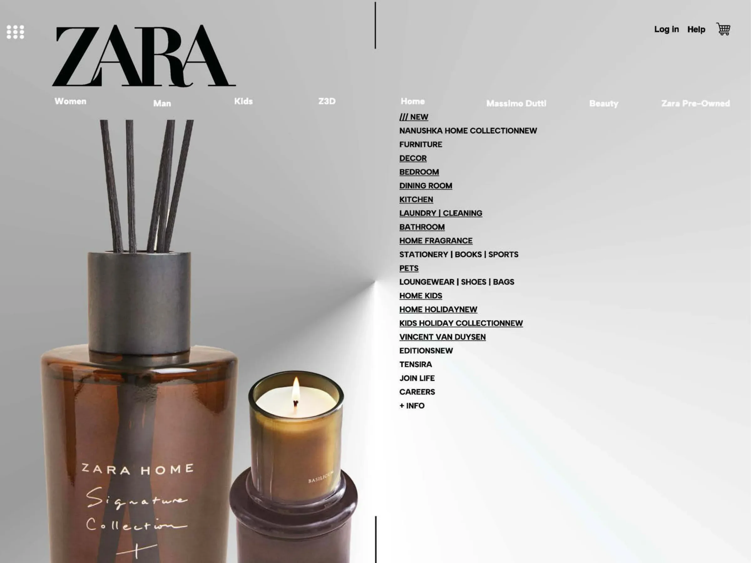
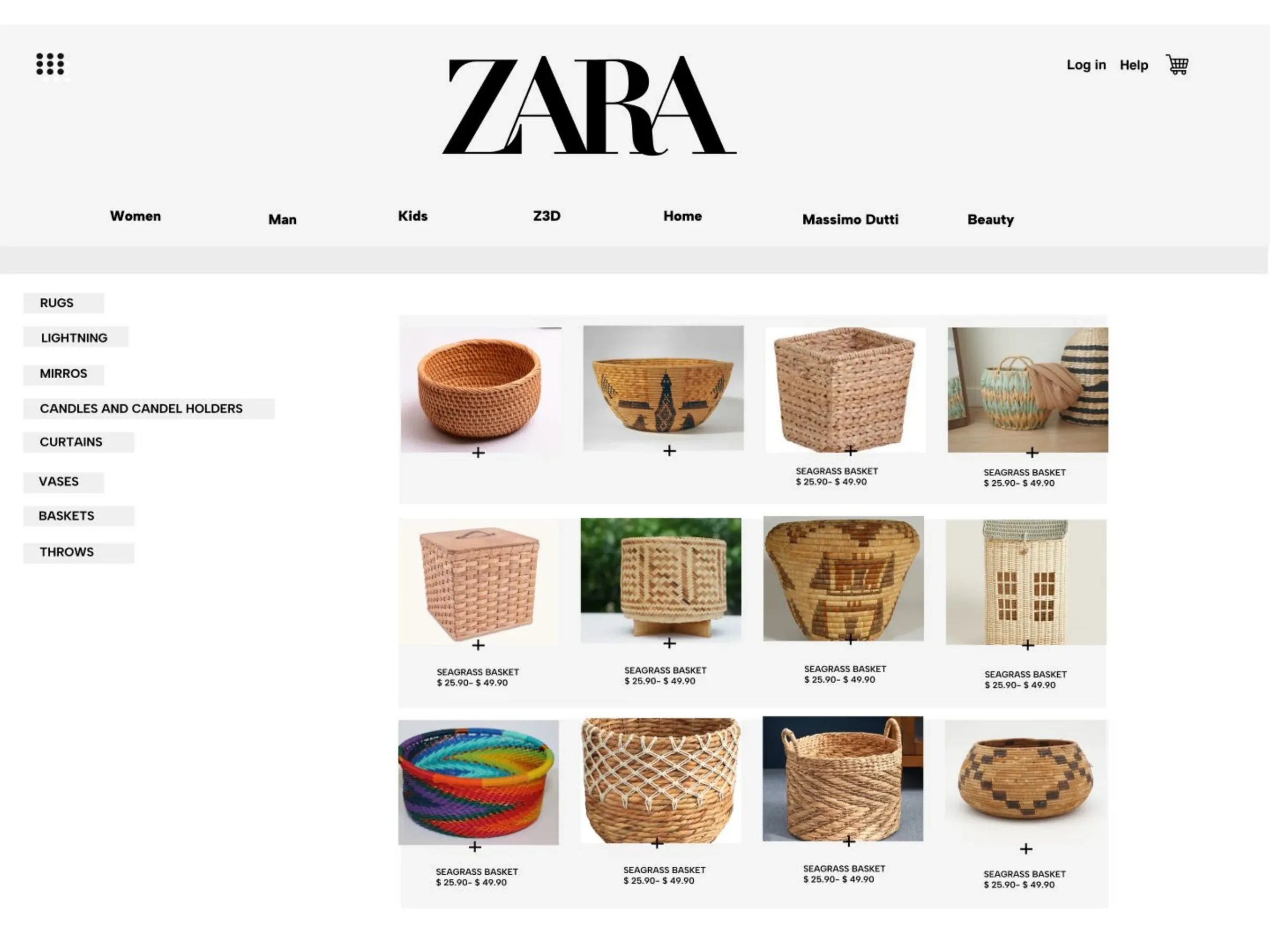
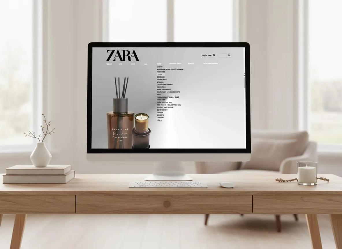
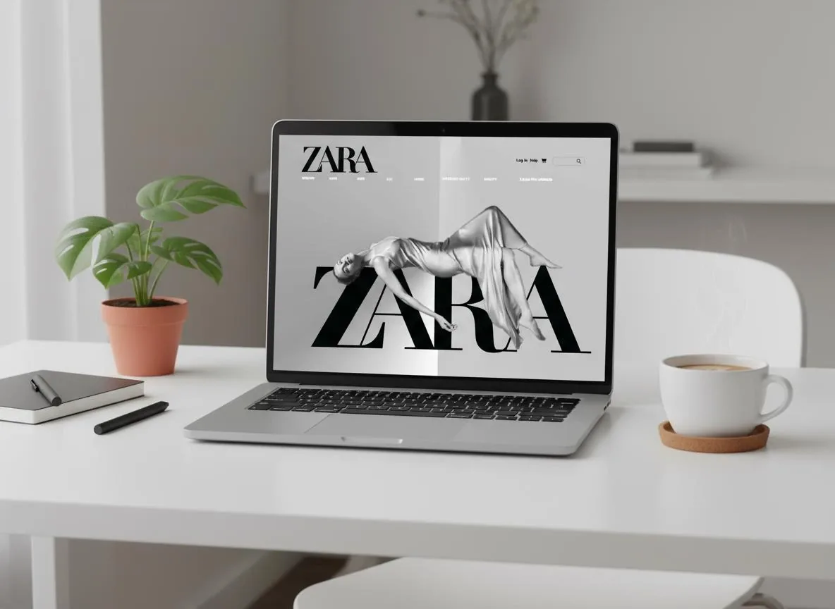
In context
Calm on every screen.
Reflection and learnings
Brand and usability, in balance.
What I learned
- BalanceeCommerce UX must serve brand and usability together.
- Luxury is subtractionEach removal made products feel more valuable.
- Systems lastEmpathy, ethics and scale make it future proof.
Next
- TestThe grid and hover light with shoppers.
- ExtendThe same language into print, case 02.