02 · Featured

Editorial print · Concept

Form, Light,
Texture

The Zara site’s gallery voice, on paper. Ten pages where fashion and objects share one quiet tone.

Disclosure

Independent concept. Not affiliated with Zara. Imagery is AI-generated and art-directed by me, as the colophon states.
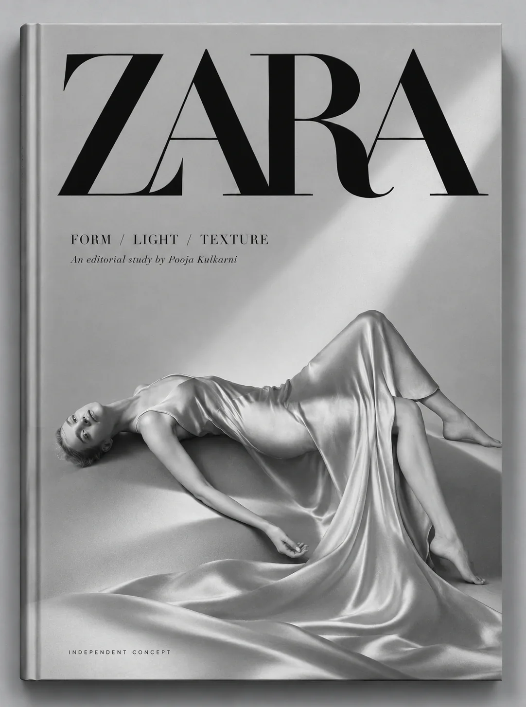
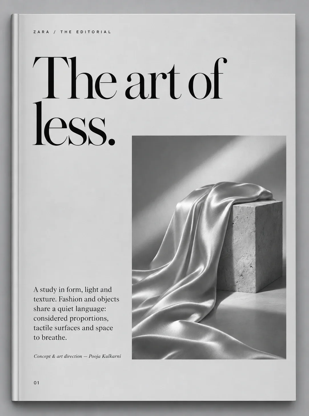
Book cover: ZARA wordmark above a figure in silver satin
Cover225 × 300 mm, soft-touch

Role

Concept, art direction, layout, type

Format

225 × 300 mm portrait

Extent

10 pages and cover

Tools

InDesign, Photoshop, AI imagery

01

Brief

From screen to paper.

If the site is a lit gallery, how does its book feel in the hand?

Same products

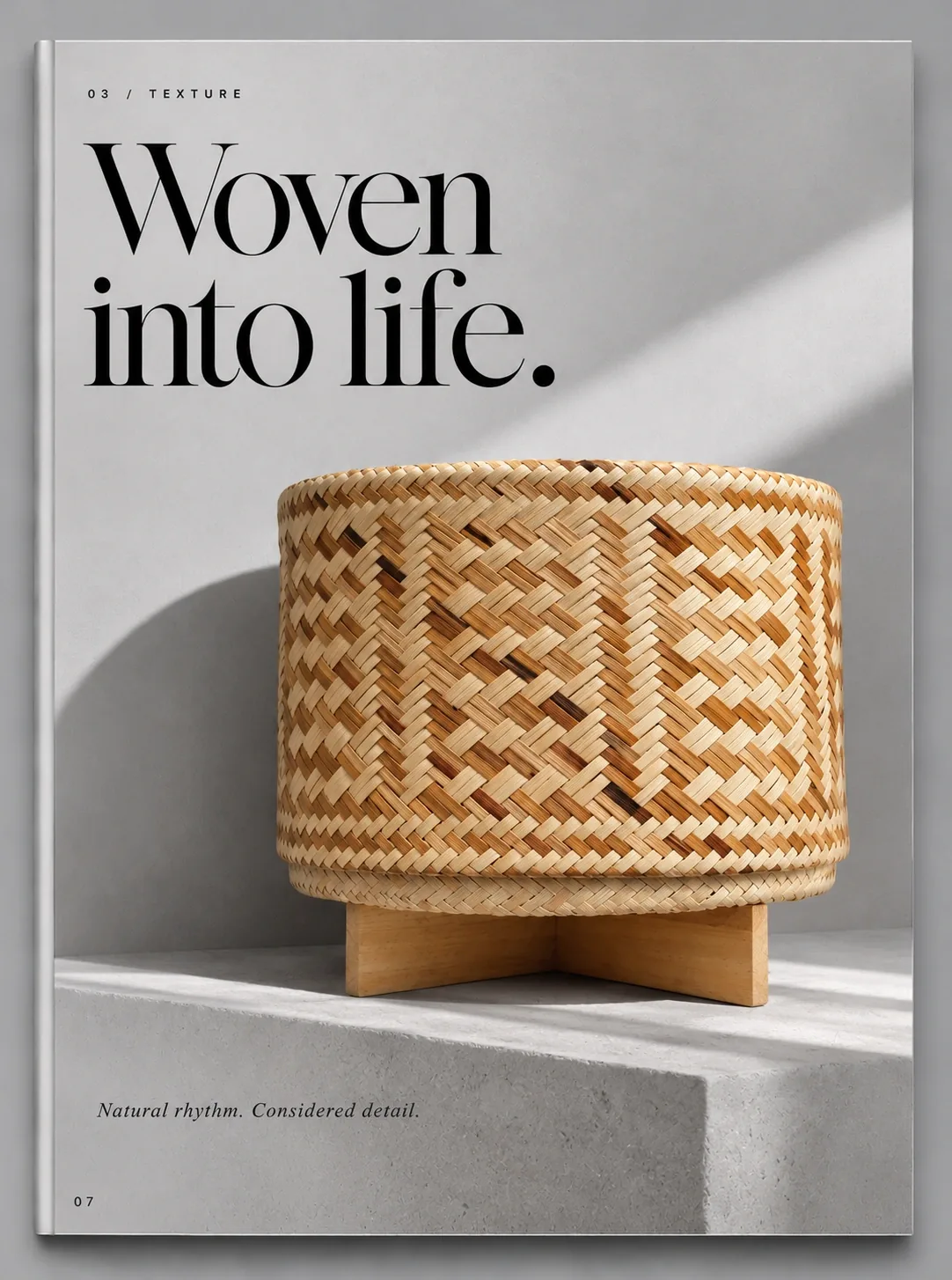
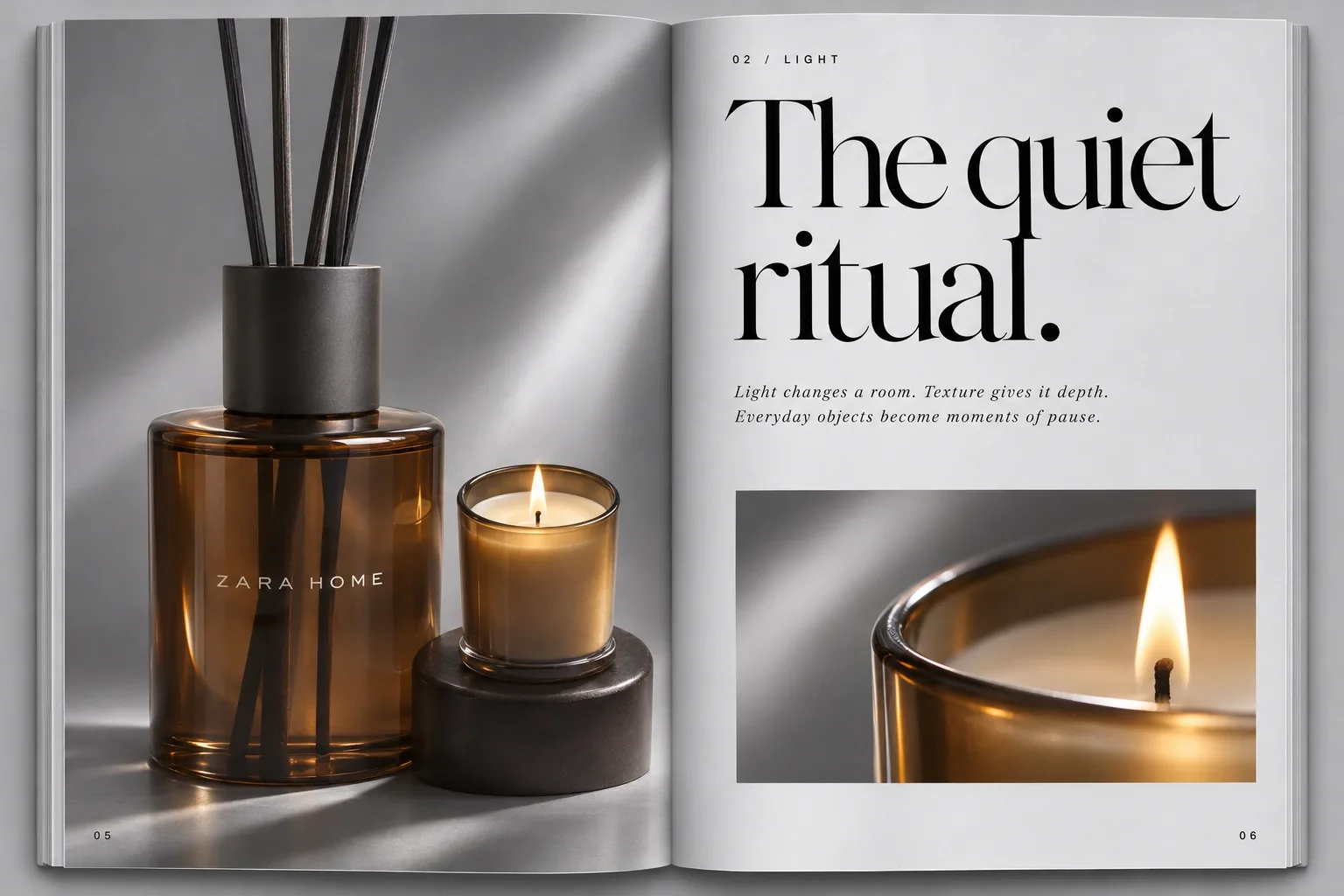
The amber diffuser and woven basket return in print.

Same light

One diagonal beam crosses every image.

Three chapters

Form, Light, Texture. Fashion, ritual, material.

Reading sequence

CoverWordmark and figure
01The art of less
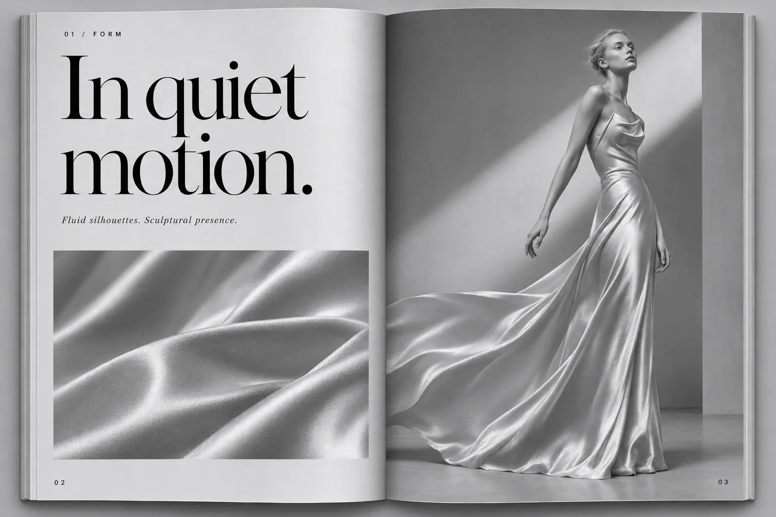
02 to 04FormMotion, structure
05 to 06LightThe quiet ritual
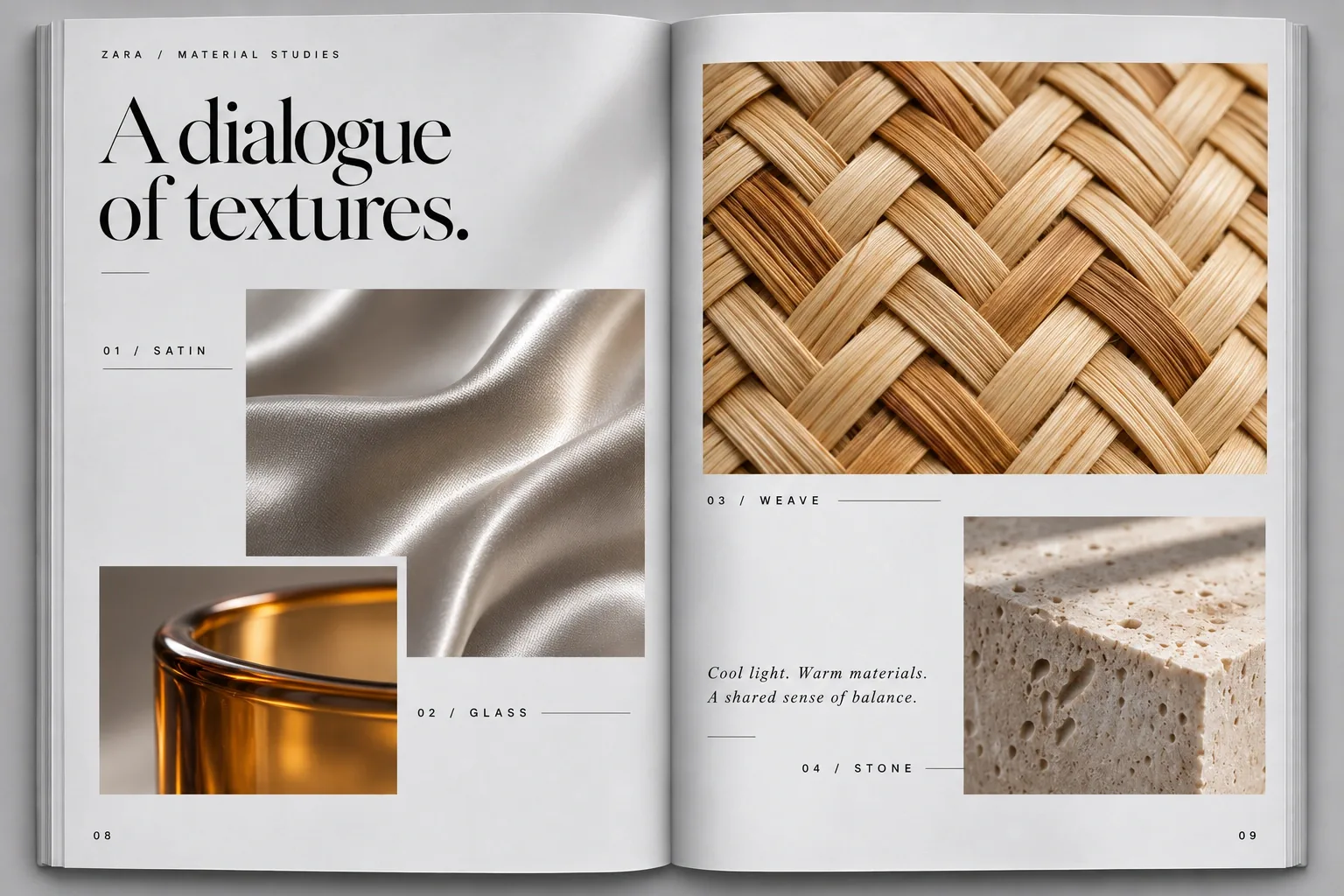
07 to 09TextureWoven, materials
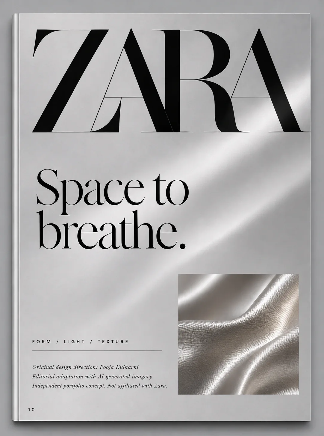
10Colophon
02

Format and materials

Designed to be touched.

A proposed production spec. Not a printed edition.
Trim225 × 300 mm, 3:4Tall for full figures. Easy to hold.
BindingSection-sewn, lay-flatSpreads cross the gutter unbroken.
Cover350 gsm, soft-touch matteA velvet hand that echoes satin. No glare.
WordmarkBlack foil, light debossThe only shine. Felt before it is read.
Interior170 gsm silkDeep blacks, smooth greys, no mirror gloss.
InksTritone and CMYKTritone for mono pages. Colour only for amber and rattan.
Extent10 pages and coverAn object, not a catalogue.
The art of less page
Soft-touchMatte ground, satin image
Colophon page
FoilThe wordmark is the only shine
Woven into life page
CMYKWarm rattan breaks the grey
03

Typography

Three voices. One whisper.

Display fonts below are web stand-ins checked against the pages.
DisplaySoft structure.High-contrast Didone. Tight, two or three words, ends with a full stop. Echoes the wordmark’s hairlines. Shown in Bodoni Moda.
Labels01 / FormClean sans, small caps, +300 tracking. Wayfinding, like store signage.
CaptionsFluid silhouettes. Sculptural presence.Italic serif. Two short sentences. The image does the talking.
Folios0 4Tracked numerals, bottom outer corner.
Spread: In quiet motion headline beside a satin gown
Fig 3.1Anatomy of a spread
  1. LabelTop left. Tells you where you are.
  2. HeadlineHangs from the top margin, huge.
  3. Italic captionA breath, not a story.
  4. Detail and figureSatin detail answers the full figure.
  5. FoliosMirror at the outer corners.
04

Colour and texture

Cool light. Warm materials.

Almost colourless on purpose. Amber and rattan arrive like warmth in a cool room.
SilverGround
SatinMid
InkType
AmberGlass
RattanWeave
TravertineStone
Material studies spread: satin, glass, weave and stone
Fig 4.1Material atlas spread
  1. SatinFluid and cool. The fashion chapters.
  2. GlassAmber warmth. Diffuser and candle.
  3. WeaveRattan rhythm. The site’s basket.
  4. StoneTravertine. The plinth for every object.
05

Page by page

How each page was composed.

Cover
CoverFigure diagonal answers the light
The art of less
01 IntroWord left, object right
Soft structure
04 FormHeadline as a title card
Spread: The quiet ritual with amber diffuser and candle
05 to 06 LightThe first colour in the book
Woven into life
07 TextureThe site’s basket on stone
Colophon
10 ColophonCredits and disclosure

Rules

  • RhythmMono, mono, colour, colour, mono.
  • LightOne beam, upper right.
  • RestraintOne idea per page.
06

Findings and outcome

What the pages taught me.

Findings

  • Short headsThree words or fewer kept pages calm.
  • Contrast by restraintGrey chapters made amber feel warmer.
  • ContinuityShared products tied print to screen.

Learnings

  • Rules for AI imageryOne light direction, one palette.
  • TransparencyThe colophon matters.
  • Paper is voiceFinish is brand, not an afterthought.

Outcome

  • A 10-page conceptWith cover and colophon.
  • A print specReady for a press check.
  • One languageAcross web and print.